The Task:
Create a product design series with your fellow illustrators, making one piece Each. in 48 hours.
Be you, but be a team.
What we did to win:
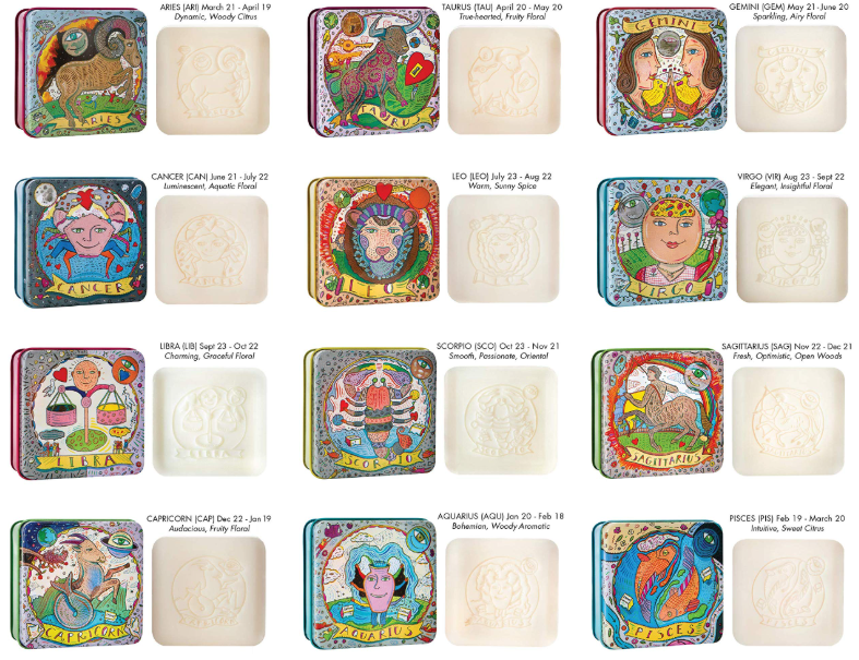
RIT’s second annual Presto! Event was run and hosted by Leslie Cober, President of the Society of Illustrators in New York. The assignment was to put our take on a commission she herself had made: a series of themed soap tins, shown here.
With a group of 4-6, we were tasked to come up with a cohesive theme and produce finished line designs in two days. Each person was to focus on one piece, allowing each of our styles to come through, while keeping consistency among each others work.
The best teams brought their series to full finish, had clear through lines in their series, and often considered the product being sold when deciding a concept for the theme.

Our group decided that a potions theme would allow each of us to pick one we would enjoy designing for, while also having each tin signify a different “scent” based loosely off of the designated potion.
We made some compositional rules:
Each tin must have a primary color being used and that cannot be duplicated between two designs.
The “ingredients” of the potion should make up the border surrounding the bottle shown, and the border should imply a shape that visually fits with the specific potion
The potions we picked were: Love, Poison, Wisdom, Healing, and Luck.
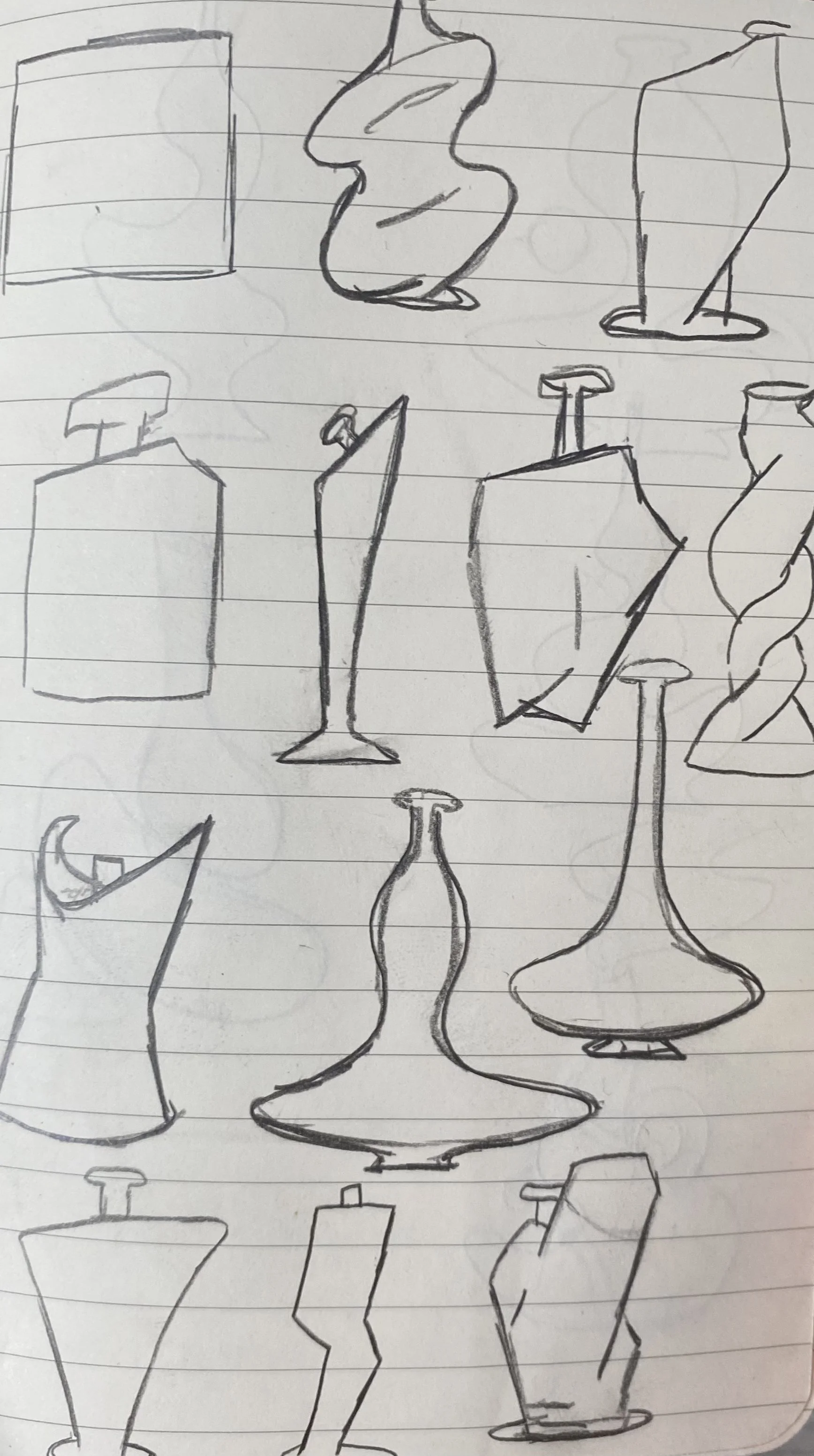
I designed Luck.

The bottle design was something I needed to iterate numerous times. I wanted to go for something energetic, and played with the properties of the bottle itself, it perhaps it was magical, or just gave off an energy in it’s design. Once solidified on the design, the background grew around it naturally. Adding lucky things like rabbit’s feet, gold coins, horseshoes, ladybugs and in the final iteration, clovers rounded out and finished the composition.

